The Importance of Color Combinations in Your Home: How to Create a Beautiful and Balanced Living Space
The colors we choose for our homes do much more than decorate walls. They influence how a room looks, how spacious it feels, how furniture fits together, and how comfortable we find our everyday surroundings. A thoughtfully designed color scheme can turn an ordinary room into a welcoming space that reflects personal taste and supports daily life.
Imagine walking into two living rooms with identical furniture and layouts. One has carefully coordinated wall colors, comfortable lighting, and decorative accents that work together. The other combines several competing shades without a clear visual direction. Although the furniture is the same, the two rooms can feel completely different.
This is the power of color coordination in interior design.
Choosing the right color combinations does not necessarily require professional decorating experience or an expensive renovation. By understanding a few simple principles, homeowners can create interiors that feel balanced, attractive, and practical.
From warm neutrals and natural greens to bold contrasts and elegant monochromatic schemes, the right palette can help every room develop its own character.
Why Are Color Combinations So Important in Interior Design?
Color is one of the first elements people notice when entering a room. Before examining individual pieces of furniture, visitors often form an impression from the overall visual environment.
A coordinated color palette helps connect walls, floors, furniture, curtains, carpets, and decorative accessories into one cohesive design.
Without that connection, even expensive furniture may appear out of place.
The importance of choosing the right colors extends beyond appearance. Color coordination can also affect the way we perceive light, proportions, and the relationship between different areas of the home.
For example, light-colored walls paired with furniture of similar brightness can create an open and airy appearance. Darker colors, when used thoughtfully, can create depth and a more intimate atmosphere.
Neither approach is automatically better. The most successful choice depends on the room’s purpose, natural lighting, dimensions, and the preferences of the people who live there.
Good color design is not about following every decorating trend. It is about creating a space that works for everyday living.
1. Understanding the Relationship Between Colors and Mood
Different colors are often associated with different feelings and atmospheres.
Warm colors such as orange, yellow, and terracotta are commonly used to create energetic or welcoming interiors. Cooler shades, including blue and certain greens, are frequently chosen for spaces intended to feel peaceful and restful.
Neutral colors such as white, beige, taupe, and gray provide flexible backgrounds that can accommodate many decorating styles.
However, color psychology should not be treated as a set of universal scientific rules.
People respond to colors differently depending on personal memories, cultural background, lighting, and individual preferences. A dark blue bedroom might feel relaxing to one person and overly gloomy to another.
Instead of assuming that a particular shade will automatically change someone’s mood, think about the atmosphere you want to create.
For a peaceful bedroom, you might explore muted blues, gentle greens, or warm neutral shades.
For a welcoming dining room, earthy colors, soft terracotta, and natural wood finishes may feel appropriate.
For a creative workspace, a carefully placed colorful accent can provide visual interest without making the room distracting.
The goal is to design an environment that feels comfortable to the people who use it.
2. The 60-30-10 Rule: A Simple Way to Balance Colors
One of the most practical starting points for interior color coordination is the 60-30-10 rule.
This commonly used decorating guideline suggests dividing a room’s visible color scheme into three approximate proportions.
- 60% dominant color: Usually applied to walls, large rugs, or major background surfaces.
- 30% secondary color: Often represented by sofas, chairs, curtains, cabinetry, or substantial furniture.
- 10% accent color: Introduced through cushions, artwork, decorative objects, and smaller accessories.
Imagine a contemporary living room with warm ivory walls, a sage-green sofa, and terracotta cushions.
Ivory provides the dominant background, green introduces a distinct secondary tone, and terracotta adds a smaller contrasting accent.
The result is a coordinated design with enough variety to avoid looking monotonous.
These percentages are not measurements that must be followed exactly. They are a useful guide for deciding which color should dominate and which colors should play supporting roles.
Homes with layered, eclectic interiors may use more than three colors successfully. What matters is maintaining a recognizable relationship between the shades.
3. Warm Colors vs. Cool Colors: Which Should You Choose?
Before selecting paint or furniture, it helps to understand the basic distinction between warm and cool color families.
Warm color combinations
Warm shades generally contain red, yellow, orange, or warm brown influences.
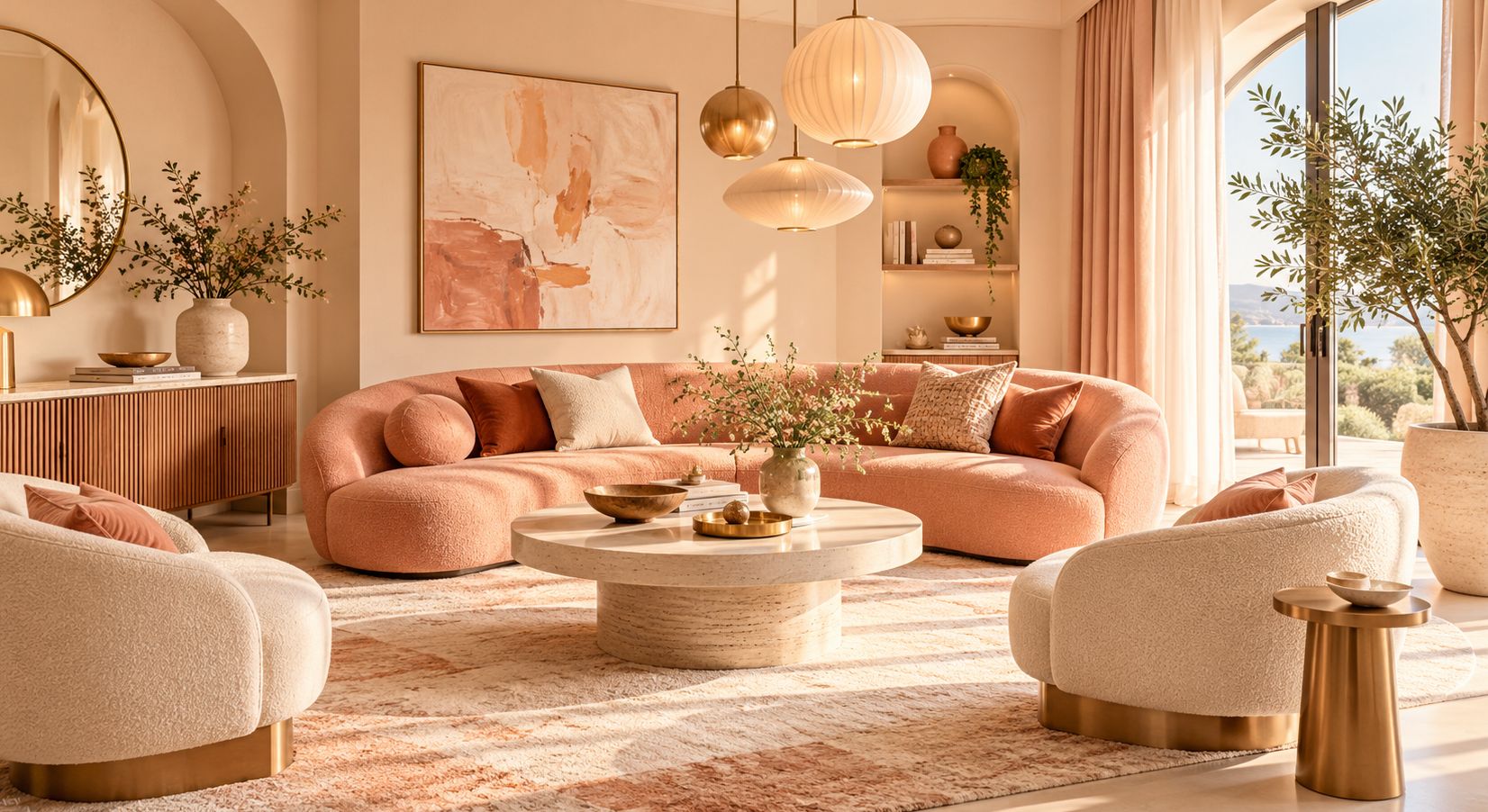
Examples include cream, caramel, beige, rust, peach, and terracotta.
These colors are often associated with inviting and comfortable interiors. They can work particularly well alongside wood furniture, woven textiles, natural stone, and traditional decorative elements.
A combination of warm white walls, oak furniture, and caramel-colored upholstery can create a timeless living room.
Cool color combinations
Cool palettes are often built around blue, blue-gray, lavender, and certain green shades.
They can provide a clean, fresh appearance, particularly when combined with simple furniture and carefully planned lighting.
For example, pale blue walls, soft gray seating, and white trim can create a spacious-looking interior.
Can warm and cool colors work together?
Absolutely.
Some of the most interesting interiors combine warm and cool elements.
A muted blue sofa against warm beige walls can create a balanced contrast. Similarly, natural wooden flooring can soften the appearance of cool gray cabinetry.
The key is to consider undertones and make sure the overall combination feels intentional.
4. How Lighting Changes the Appearance of Your Colors
A paint color that looks perfect in a store may look surprisingly different once it is applied at home.
One of the main reasons is lighting.
Natural daylight changes throughout the day, while artificial lighting introduces its own color characteristics.
A cream wall may appear nearly white in strong sunlight but look distinctly yellow under warm indoor lighting.
Similarly, a pale gray wall can appear slightly blue in a room receiving cool, indirect daylight.
The direction of the windows also matters.
North-facing rooms in the Northern Hemisphere frequently receive cooler indirect light, while south-facing rooms may receive stronger, warmer sunlight.
East-facing rooms often experience more direct morning light, whereas west-facing rooms receive greater afternoon exposure.
Before choosing a final color, test samples on different walls.
Observe them in the morning, afternoon, and evening. Also check their appearance when the room’s normal lamps are switched on.
This simple step can prevent disappointing results and unnecessary repainting expenses.
5. The Best Color Combinations for Living Rooms
The living room is often the central gathering space of a home.
It may serve several purposes, including relaxing, entertaining guests, watching television, and spending time with family.
For this reason, the color scheme should balance visual interest with comfort.
Beige, white, and natural wood
This classic combination works well in both traditional and modern interiors.
Warm beige walls create a soft background, while white ceilings and natural wooden furniture introduce brightness and texture.
The result is a versatile room that can be updated easily with different cushions, artwork, or seasonal decorations.
Sage green, cream, and light brown
Sage green has become a familiar choice in interiors inspired by natural materials.
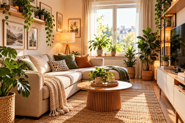
Combined with cream textiles and light brown furniture, it can create a relaxed and understated atmosphere.
Indoor plants and wooden accessories reinforce the natural appearance.
Navy blue, light gray, and brass
For a more dramatic design, navy blue can serve as an accent color alongside soft gray upholstery.
Brass-colored lamps, frames, or furniture details add warmth and visual contrast.
This combination can work especially well in living rooms with adequate daylight or thoughtfully arranged artificial lighting.
6. Choosing Relaxing Color Combinations for Bedrooms
Bedrooms usually benefit from color schemes that feel restful and visually comfortable.
This does not mean that every bedroom must be painted white or pale blue.
The right color depends on how the room is used, its lighting, and individual taste.
Popular combinations include:
- Soft blue, warm white, and light oak.
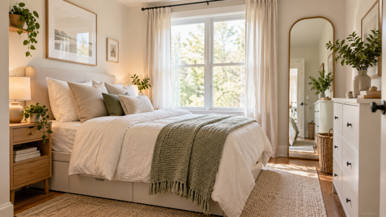
- Muted sage green, cream, and beige.
- Dusty rose, ivory, and natural linen.
- Charcoal gray, warm taupe, and walnut brown.
A bedroom with muted green walls and off-white bedding can feel soft and inviting.
For a more dramatic effect, deep charcoal or dark blue walls can create a cozy appearance when paired with appropriate bedside lighting and warm textiles.
Avoid choosing bedroom colors solely because they are fashionable.
Consider whether the combination will remain comfortable over time and whether it complements existing wardrobes, flooring, and curtains.
7. How to Combine Colors in the Kitchen
Kitchens require special attention because their color schemes often involve permanent or expensive elements.
Cabinets, countertops, backsplashes, appliances, and flooring may remain unchanged for many years.
Instead of choosing wall colors first, begin with the materials that are most difficult to replace.
If the kitchen features warm wooden cabinets, consider colors that complement the wood’s undertones.
For white cabinets, the possibilities are broad. Warm gray, muted green, soft beige, and natural stone finishes can all create attractive combinations.
Three practical kitchen palettes include:
White and natural oak: A bright, timeless pairing that suits Scandinavian-inspired and contemporary interiors.
Sage green and cream: A softer alternative to completely white cabinetry, especially when paired with brushed metal hardware.
Charcoal and warm wood: A striking modern combination that benefits from good task lighting and sufficient visual contrast.
Kitchen colors should also support practical requirements.
Surfaces need suitable finishes that can withstand cleaning, moisture, and ordinary cooking activity.
Choose durable products intended for kitchens rather than prioritizing color alone.
8. The Role of Color in Small Spaces
Color can significantly influence how large or small a room appears.
Light-colored surfaces generally reflect more visible light than dark surfaces, which can help a compact room appear brighter.
However, painting every surface white does not automatically make a room feel spacious.
A successful small-room design also depends on furniture proportions, storage, lighting, and the amount of visual clutter.
One effective strategy is to use closely related colors on walls, larger furniture, and curtains.
This creates fewer sharp visual divisions and can give the room a more continuous appearance.
For example, soft beige walls paired with cream curtains and light oak furniture may make a small bedroom feel visually unified.
Another approach is to use a darker accent wall to create depth.
Dark paint can work beautifully in compact rooms, particularly when the remaining furnishings and lighting are chosen carefully.
Rather than avoiding dark colors entirely, pay attention to balance and contrast.
9. Neutral Colors: The Foundation of a Timeless Home
Neutral shades remain popular because they are flexible and easy to coordinate with other colors.
White, beige, taupe, gray, cream, and warm brown can serve as foundations for many design styles.
However, neutrals are not all the same.
A cool gray with blue undertones can look very different from a warm gray containing beige or brown influences.
Similarly, some whites have subtle yellow or pink undertones, while others appear cooler.
Choosing neutrals without considering these differences can lead to an unexpected mismatch between walls, furniture, and flooring.
One practical method is to compare paint samples directly against existing fixed finishes.
Place the sample beside the floor, kitchen cabinets, sofa fabric, or stone countertop.
If the undertones look incompatible, try another shade within the same color family.
Neutrals create an adaptable foundation, but their subtle differences deserve careful attention.
10. Accent Colors: Adding Personality Without Overwhelming a Room
A room with a coordinated neutral palette may still benefit from a little visual excitement.
Accent colors provide an easy way to introduce personality without repainting the entire room.
They can appear through cushions, artwork, rugs, vases, lamps, or upholstered chairs.
Imagine a living room with beige walls, a cream sofa, and wooden furniture.
Adding a few terracotta cushions and a matching decorative vase can introduce warmth and variety.
A room dominated by white and gray might benefit from muted green or deep blue accents.
The key is repetition.
When a selected accent appears in two or three locations, it can help the room feel connected.
You do not need to match every accessory perfectly. Slight variations in tone and texture can make the design feel more natural.
For homeowners decorating on a budget, accent colors are particularly useful because smaller accessories are relatively easy to replace.
11. How Flooring and Furniture Influence Color Choices
Wall paint is only one part of a room’s color scheme.
The flooring often occupies a large visible area, making it one of the most important design elements.
Warm oak flooring may complement cream, earthy green, and soft brown tones.
Cool gray flooring can work with blue-gray, off-white, and carefully chosen warmer accents.
Dark walnut floors can provide strong contrast against lighter walls and furniture.
Before making major decorating decisions, identify the dominant tones of elements you intend to keep.
These may include:
- Flooring and built-in cabinets.
- Large sofas or dining tables.
- Kitchen countertops and tiles.
- Window frames and interior doors.
- Fireplace surrounds and stone features.
Treating these elements as part of the color palette helps create a unified interior.
It also reduces the risk of choosing fashionable wall colors that clash with expensive existing materials.
12. Creating Color Harmony Between Different Rooms
A well-designed home does not require every room to use the same paint color.
Different spaces can have distinct personalities while still feeling connected.
One way to achieve this is to choose a small group of colors that appear throughout the home in different proportions.
For example, warm ivory could be used in the hallway and living room, while muted green appears in the kitchen and bedroom accessories.
Natural wood tones might provide another consistent element.
This approach creates continuity without sacrificing variety.
Transitions are especially important in open-plan homes, where the kitchen, dining area, and living room may be visible simultaneously.
Using too many unrelated colors within one open space can create visual confusion.
A shared neutral background with carefully selected secondary colors often provides a more cohesive result.
13. Common Color Combination Mistakes to Avoid
Even attractive individual colors can produce disappointing results when combined without planning.
One common mistake is selecting paint based only on a small sample seen under store lighting.
Another is using several intense colors without establishing a dominant shade.
Homeowners may also overlook undertones, creating combinations that appear slightly mismatched even when the colors seem similar at first glance.
A further mistake is ignoring existing furniture and fixed finishes.
Replacing an entire sofa or floor simply because a newly chosen wall color does not coordinate is rarely cost-effective.
Finally, avoid depending entirely on digital photographs when selecting precise paint colors.
Phone screens and computer monitors can display shades differently from actual painted surfaces.
Use online inspiration to narrow down your ideas, but make the final decision using physical samples in your home.
14. How to Refresh Your Home’s Color Palette on a Budget
Improving color harmony does not have to involve major renovation work.
Small changes can make a noticeable difference.
Start by identifying the colors already present in your home.
Choose one dominant shade, a complementary secondary color, and a limited number of accents.
Next, consider affordable changes such as replacing cushion covers, adding a throw blanket, changing curtains, or introducing a coordinated rug.
Rearranging artwork can also help create a more consistent palette.
If repainting is necessary, focus first on rooms where the existing colors are particularly mismatched or where an update would make the biggest practical difference.
Before buying paint, calculate the required coverage, test samples, and select appropriate indoor products.
When painting indoors, follow the manufacturer’s safety instructions and ensure adequate ventilation.
Low-emission interior paints can be worth considering, particularly in frequently occupied rooms.
A thoughtful plan can deliver an attractive result without unnecessary spending.
15. Should You Follow Interior Design Color Trends?
Interior design trends can provide useful inspiration, but they should not determine every decision.
Popular colors change over time.
A shade that dominates social media today may no longer feel fashionable a few years later.
Rather than redesigning an entire home around a temporary trend, consider using timeless colors for expensive or permanent elements.
Trend-inspired colors can be introduced through smaller accessories, accent walls, or textiles.
This allows the home to evolve without constant renovations.
The most successful interiors usually reflect a combination of practical needs, personal preferences, and consistent design choices.
A comfortable home should feel welcoming to the people living in it, not simply resemble a photograph from a decorating magazine.
Frequently Asked Questions About Home Color Combinations
What is the best color combination for a modern home?
There is no single combination that suits every modern home. Popular options include warm white with natural wood, beige with sage green, and charcoal with cream. The best choice depends on the home’s lighting, architecture, and existing furnishings.
How many colors should I use in one room?
Three main colors are a practical starting point. One can serve as the dominant color, another as the secondary color, and the third as an accent. More colors can work successfully when their tones and proportions are coordinated.
Which colors make a small room look bigger?
Light neutrals, soft off-whites, and closely related shades can create a more continuous and airy appearance. Good lighting, suitable furniture proportions, and reduced clutter are equally important.
Can I combine gray and beige in the same room?
Yes. Gray and beige can work beautifully together, especially when their undertones are compatible. A warm gray, sometimes called greige, can provide a useful transition between the two.
Should every room in a house have the same color?
No. Individual rooms can have different colors, but repeating selected tones, materials, or finishes helps create visual continuity throughout the home.
What is the easiest way to change a room’s colors without repainting?
Changing cushions, curtains, rugs, artwork, and decorative accessories is often the simplest approach. These items can introduce new colors while allowing the main wall color and furniture to remain unchanged.
Conclusion: The Right Colors Make a House Feel Like Home
Color combinations play an essential role in creating an attractive, comfortable, and functional home.
The right palette can bring harmony to furniture and architectural features, influence the perception of space, and support the atmosphere you want in each room.
Understanding warm and cool colors, using a balanced color scheme, considering natural light, and paying attention to undertones can make decorating decisions much easier.
You do not need expensive furniture or a professional designer to achieve an appealing result.
Often, the greatest improvement comes from coordinating the elements you already own and introducing a few carefully selected colors.
Whether your style is minimalist, traditional, contemporary, or eclectic, a thoughtful approach to color can transform the appearance of your home.
Ultimately, the best color combination is not simply the one that looks impressive in a photograph. It is the one that makes your living space feel comfortable, personal, and genuinely yours.
Sources and Further Reading
- Benjamin Moore – How Light Affects Colour — Guidance on room orientation, lighting, paint finishes, and testing colors.
- Sherwin-Williams – Understanding Paint Undertones — How underlying color tones and lighting affect the appearance of paint.
- Benjamin Moore – Warm and Cool Colors — Advice on combining warm and cool color families.
- U.S. Environmental Protection Agency – Healthy Painting Guidelines — Recommendations for safer indoor painting and ventilation.